Welcome to my first graphic designer project! I know that I have already introduced myself, but this is my journey as a Strategic Communications graduate student at Washington State University and learning graphic design. This was a practice piece that we got the opportunity to put all the elements together and it was fun and challenging.
Every design that was asked for this project had a concept in mind. I took the time to go through the whole project brief to make sure that I understood the intended message and what kind of audience we were going trying to align with. I then aimed my approach to capturing the attention, build the desire, and prompt the overall feel of the dynamic.
Bringing the design to life using Adobe InDesign was exciting and interesting. With this first design I learned about typography, visual storytelling, and graphic design. I had a step process that I went with, and I am going to explain the steps and how I put them into action.
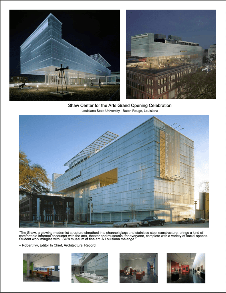
- Setting up my workspace: I began by going the through the documents and setting up my workspace by what photos of the new design I thought would catch the eye of the audience.
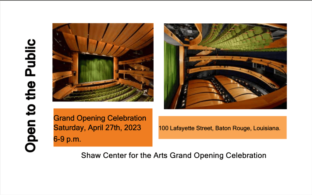
- Then I chose which typography I want to use. I know that it couldn’t be too fancy because this was an important art opening. So, I went with a sans serif and made sure that the font size was a good choice while showcasing the title on each page.
- My next step is color and since this was a draft and I didn’t really have much of a color option I went with the typical black font color for the simple fact that it was a professional photo and invitation and with a white background and black font it let the colors in the photos pop. Which is the goal of the whole idea and project.
- My next step was the alignment and layout. Wanting to make sure that I used the right photos while still being able to sell my story. I chose those top five because it told a story while also expressing the hard work that was put behind this entire project. I then went for simplicity in the invite because we want to focus on the actual event. I also chose to find close matching ones for the social posts to make it seem perfectly well rounded.
- After doing my final walk through of the assignment and fixing anything that needed to be fixed or adjusted and then I made sure there were no errors which is something that I have dealt with in the past working with Adobe. I was able to fix those errors and then go and export the file and save it to be able to download and see my final product.
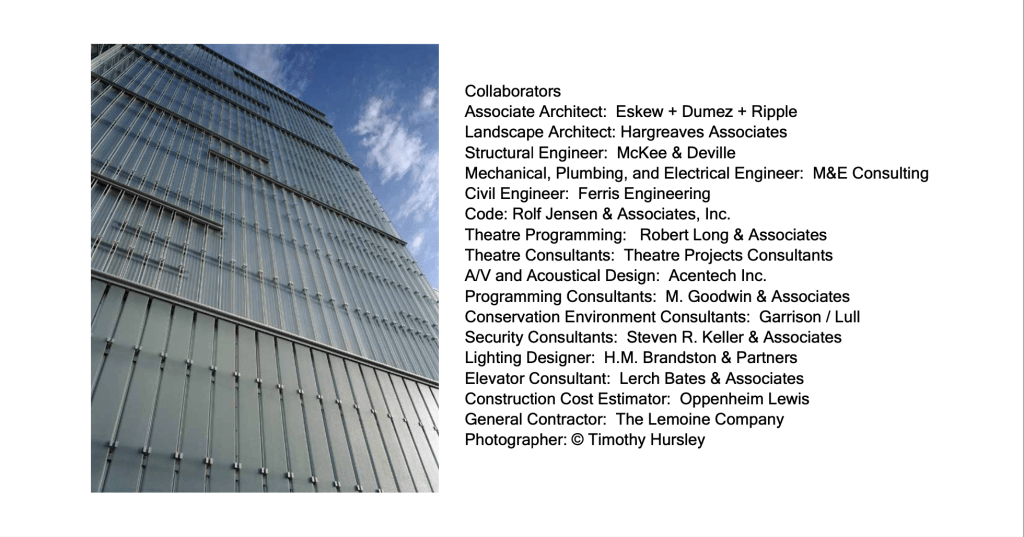
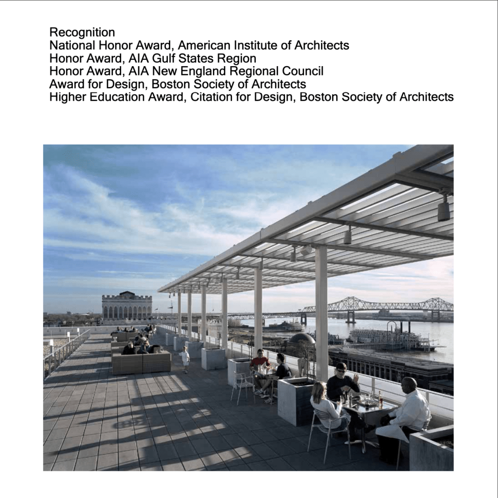
- Feedback time I took the feedback very seriously and did my best to take all of their feedback and incorporate it with the new project. I ended up redoing the entire project, because the feedback suggested that I write more on the pictures of the information that was readily available for the first draft project. I was able to add all of the necessary credits because I had the opportunity to see my work from a different point of view.
- I opened the template and got to work on it I chose to use almost all different pictures and arrange them to fill more negative space. I also wanted the chance to fill in spots that didn’t have enough information. I was able to fix all of this with the amazing help from my peer feedback.
- I did my final look at it and pulled up the draft did a side to side made sure that I could pinpoint all of my changes and then I exported it to a PDF and saved in for the final project.
This project was more than just creating a visually appealing design: it was about communicating a message, while learning and utilizing a new design tool. As I continue this journey in graphic design and learning from this class I am reminded of the power of visual communication. This is not just about what I created, but it is about how the target audience feels about my design. I am looking forward to all of the designs to come and this is just my beginning.

Leave a comment