When starting this project, I was not sure what I wanted my initial business
to consist of or be. Then it came to me that I love working out and what a joy
it would be to have the opportunity to design an innovative dumb bell. I
thought of this idea for many reason the first being I hate having to stop my
work out because I am not being challenged and get a heavier weight. How
amazing would it be to have it all in one place. Here is where I decided on the
design concept of GreenGrip. The design process was a thoughtful journey of
creativity, technology, and strategic storytelling. This blog post will jump
into this journey, focusing on the creation of bold and impactful
typography/logos in Adobe Illustrator and the integration between Photoshop and
Illustrator, all while adhering to the principles of respectful and inclusive
design.
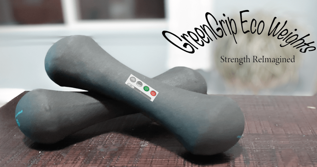
The Design Journey Begins:
The inception of any design project starts with understanding the core
message it intends to convey. For GreenGrip, the essence is empowerment and
innovation in fitness. This narrative shaped every design choice made, from the
typography to the color palette and graphic elements. This process began with
concepts that visually represent strength and flexibility, crucial terms from
our readings on design thinking and visual communication.
Design isn’t just about choosing fonts; it’s about creating a voice that
speaks to the audience before they even read a word. For GreenGrip, the goal
was to design a product it represents.
The New Design Journey:
After turning in my draft for the product and receiving the peer feedback I
could see where I needed the most improvements and how I was going to go about
navigating these fixes. Something that all of my peers had in common was the
darkness of the pictures and not having a title, possibly it being too wordy on
some of the posts. Here is what I did to try and incorporate all of the feedback.
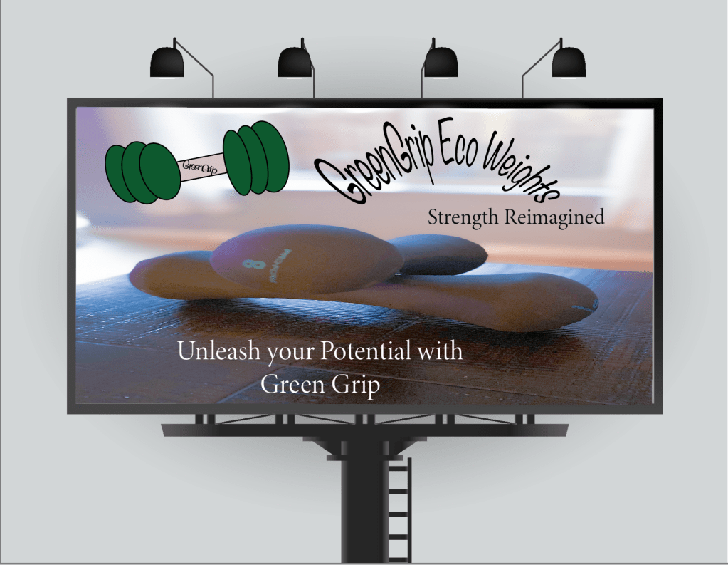
1.
I first went in Adobe Illustrator to make a title and
design it to give it so funky design. I really liked this idea and it seemed
more appropriate than to have all of that extra wordy information that in
reality no one is going to read. I was able to warp it and give it a stretched
look.
2.
Then I went on to take some of the photos and delete
them from the whole project because they were too dark. The ones that I did
choose I added that to Adobe Photoshop and open the camera raw filter and did
my best to lighten them up. I will be transparent I am having a few problems with
that I just feel like I am not doing it correctly. I was able to lighten what I
could then add less pictures, and then I added some animated ones too.
3.
I was then able to add a few features on my animated
pictures to give it the look that I was explaining since that was also feedback
from my peers.
4.
I did a layer and added a background color to the
brochure. For some reason I could not figure out how to do it to the other
pieces which was upsetting but I did get one done and I really liked the
outcome.
5.
I changed the font a little bit made it bold, bigger,
stretched and I think overall it came out really well.
Overall, I think that the feedback was great, and it improved my whole
design concept and I can appreciate the look of it more now than I had before.
I think practice makes perfection and I still have a long way to go, but I
think that it seems to be getting more understandable with each project.
Conclusion: A Story Told Through Design
The design process, from concept to completion, is a narrative in itself.
For GreenGrip, it was about embodying the essence of strength and innovation
through every element. By leveraging the technical capabilities of Illustrator
and Photoshop, alongside a mindful approach to storytelling and inclusivity, a
design was created that not only captures attention but also respects and
celebrates its audience.

Leave a comment