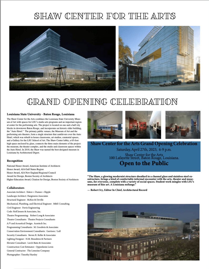
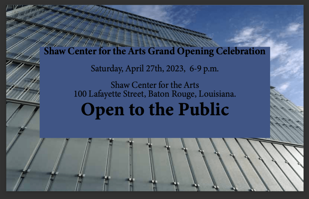
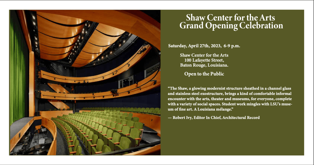
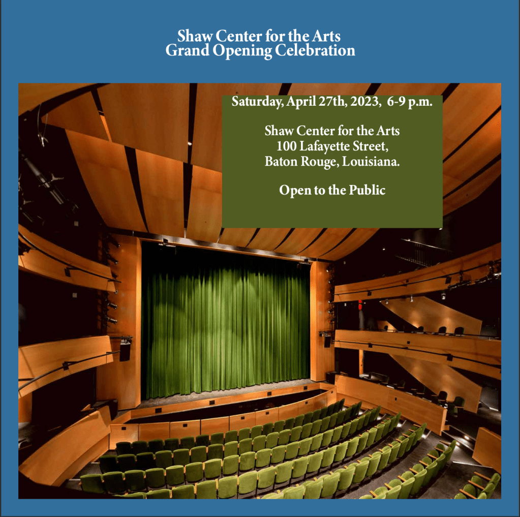
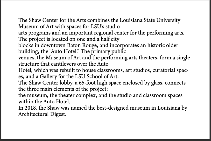
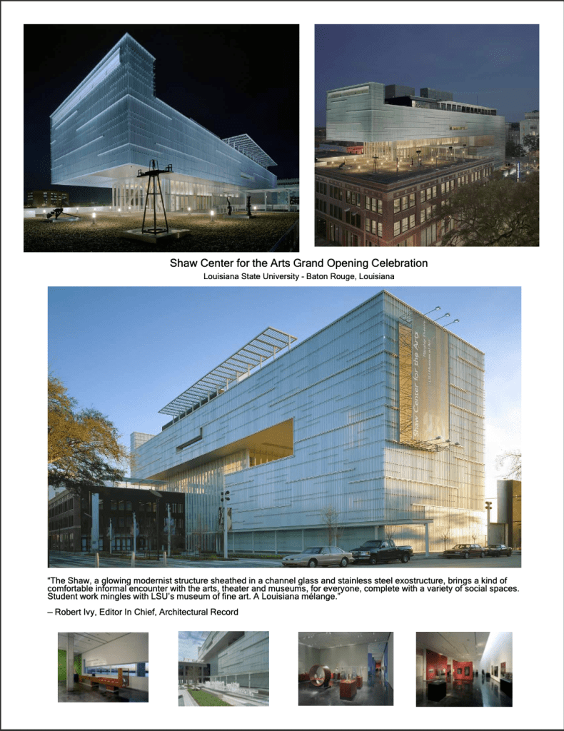
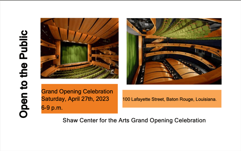
Well, the time has come that this class is over and for our final assignment we got to redo one of our prior projects. I chose to do the unit 1 assignment in Adobe InDesign. I chose this one because it was the very first project we did, and I think I’ve learned a lot more about Adobe in general so looking back at my first project I see the white space and the unevenness and not adding the colors and not just being expressive with how I do my projects. When it came to what I altered I made sure to Add all the information that was needed first and foremost and then second I added the pictures that I thought went with the theme and I also was able to stretch them without making them look blurry which is something I struggled with but now I know how to do overall I think that it just looks more presentable I added background colors on some of them in text boxes over the pictures which is something that I have learned that I like better than just riding over the white and black. I think overall my vision on the new one came out how I would present it to whoever was throwing the party I think that I feel more comfortable with it I think that less is more and also it gives a perfect explanation of what I was doing. My defined audience would be the art museum and the art collectors. The thing that I took from this class is less is more know that having the right size pictures and spacing can tell a story just as good. I know that overall, it just looks cleaner and more organized and the details are in there.
Here is the redo of my final project. Below is the original for comparison just on how far I have come in this class!!!!

Leave a comment